Yeh, I changed the format
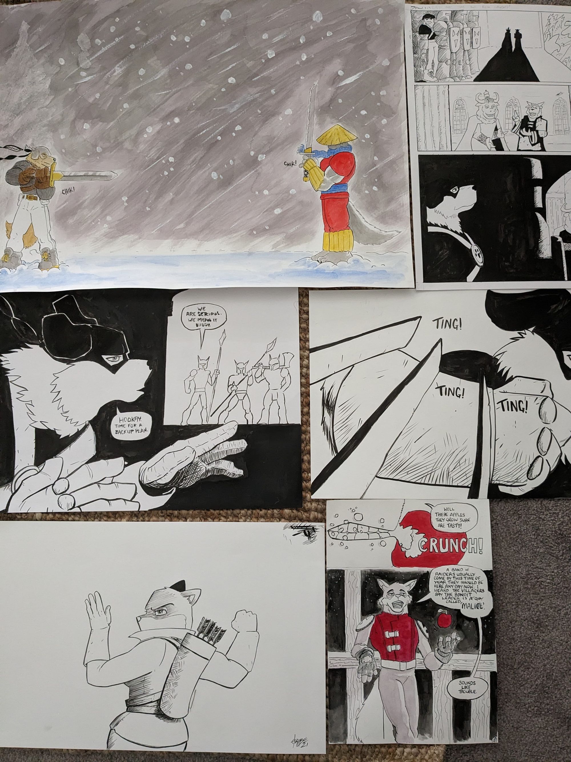
I know what your thinking, why is this guy redrawing a comic he published nearly a decade ago? Is he out of ideas?
Great question.
Here's the answer. It's taken me about 10 years of making comics to land on my actual art style. I can't remember who said it but they said "your style is the way you draw things wrong". I agree. Over the last 9 years I have drawn a lot less comic pages than I was intending to that's for sure. I think my lowest output was 5 pages in a whole year!
The consistency of the art was patchy and that created a negative feedback loop. I got downcast because from page to page stuff looked different. If I was looking at Bleach I would add scratchy lines like Tite Kubo did. If I was looking at TinTin I would add the sqiggly movement things like Herge. One thing about Tribe's in general is we are all perfectionists. I have spent way too much time mucking about with individual pixels no one will ever notice due to these tendencies. Perfectionists also tend to be procrastinators because if it's not perfect it should not be out in the world. But this is comics, and they are hard work, so at the end of the day, done > perfect.
So yes, I want the relaunch of the title to have a more consistent look. The characters trade mark sayings and other eccentricities have also cemented over the years, and I wanted to include those from the beginning too.
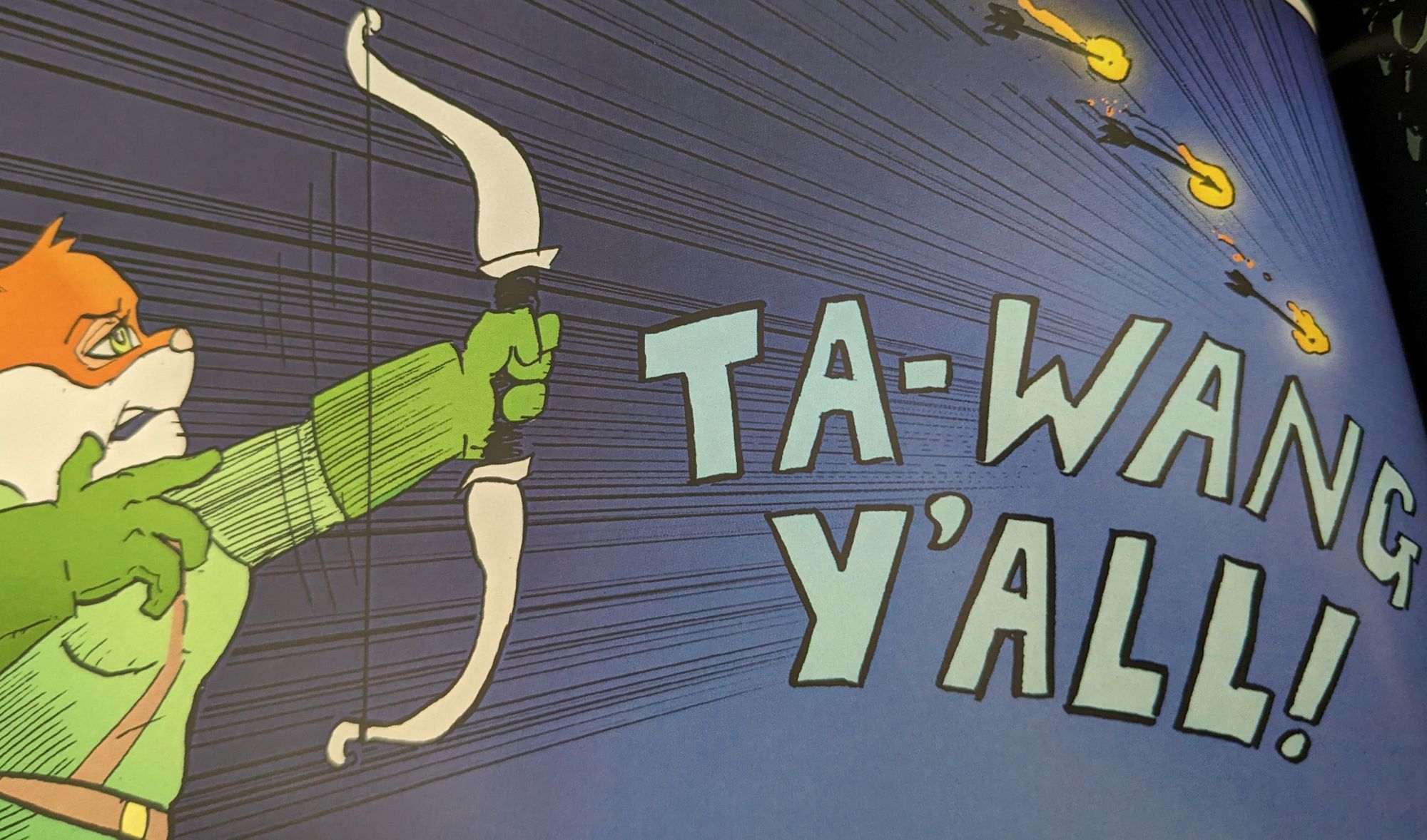
Things like Cheek's now famous war cry for example...

Rules, Schmules...
For a long time I would apply a lot of arbitrary rules when making comics.
I realised that this rule applies equally in making comics as it does in a Dungeons & Dragons game. It's called the rule of cool and trumps all other rules. Wikitionary.org defines it thus:
Noun. rule of cool. The principle that anything is acceptable to do, use, wear etc. just as long as it is cool.
The coolness is more important than the methods used to get there.
For example, why did I impose that every page needs to be drawn on an A3 sheet of paper? Nick Pitarra in his upcoming book Axe Weilder Jon, has drawn EVERY PANEL on 11 x 17 inch boards! I played around with this approach on some pages of The Castle Part 2, it is really fun, but a bugger to size right when collating the panels into a page on the computer.
The TLDR is that now I use whatever page size works. Some pages have lots of stuff in them, so I draw that on A2(16.5 x 23.4 inches), most pages are just A4(8.3 x 11.7 inches) because inking A4 takes half the time of inking A3(17.5 x 16.5 inches) and gives me the illusion that I'm getting more done.

This really helps give me the illusion of momentum as I feel I am getting more done.
That's not the only format change though.
The final product is gonna be more like the format of a manga book. So much smaller than regular comic size. This is a ruthlessly mercenary act as I try to use this to break into the 'book market' to increase the likelihood of library adoption of my work.
What are your thoughts on arbitrary rules you impose on yourself? Let me know via email or in the comments.
What's hitting this week?
- The closure of Book Depository was surely unexpected. Especially considering it is owned by Amazon. I use Amazon and Kmart as purchases of last resort, and can mostly succeed in this. It's a timely reminder to support small and independant businesses. Any preorders that were cancelled by book depository are now coming from my 'Local' comic book shop, only 2 point something hours drive away but it has strengthened my resolve to 'shop small'.
- I'm enjoying the Vinland Saga anime on Netflix, and not to sound like "that guy" but the manga is way better. Maybe you could support a local small business and grab a copy???